|||| | |||| |||| |||
Create
Your Own Page
Explore plugins, tools and templates for your Carrd website
{ Plugins }
All plugins are ss(responsive)tt(Adapts to any screen size)ee
Fixed001 Navigation
Fixed Navigation001
Always part of your site.
This plugin keeps your navigation seamlessly fixed at the top of the screen. No need to worry about whether your site has a hero section before the navigation—it will adjust and staying where it should.You can use it with the Fixed Menu Plugin to enhance its functionality.
-
Not ready for this? ▶ Widget - Fixed Navigation
Ingredients: CSS, JavaScript
▼ Single License - $30 USD
▼ Unlimited License - $300 USD
You'll need at least the Carrd Pro Standard Plan (with the embeds feature) to use this plugin.
launched
2025-02-24
Clip002
Expand and manage your content easily
Click Expand to see it in action
This plugin allows you to manage and display page content more dynamically. It also supports multiple column layouts.Heads-up: sounds effect is not included.
-
Not ready for this? ▶ Widget - (Un)fold
Ingredients: CSS, JavaScript
▼ Single License - $15 USD
▼ Unlimited License - $150 USD
You'll need at least the Carrd Pro Standard Plan (with the embeds feature) to use this plugin.
| Update | Launched |
|---|---|
| 2025-07-10 | 2025-02-27 |
Shimmer003
Add a small touch
Add a shimmer effect to target images as they enter the screen to make them visually attractive. You can adjust the color, width, animation start and end points, and choose whether to sync it with scrolling.
Ingredients: GSAP, CSS, JavaScript
▼ Free - receive TXT files and a PDF guide.
You'll need at least the Carrd Pro Plus Plan (with the embeds feature and advanced setting feature) to use this plugin.
| Update | Launched |
|---|---|
| ss(2025-08-12)tt(• Supports non–full-size images • Resolves conflicts with Overlay tags)ee | 2025-03-05 |
Drop Box019
Interactive Demo ▼
Drop Box019
◀ Interactive Demo
This plugin lets you attach a drop box to your element— even a menu that sticks to the top, or something that moves as you scroll.
You can use it as a dropdown menu, or simply as a message box for your users.
-
You might also like this ▶ Widget - Fixed Navigation
Ingredients: CSS, JavaScript
▼ Single License - $15 USD
▼ Unlimited License - $150 USD
You'll need at least the Carrd Pro Standard Plan (with the embeds feature) to use this plugin.
launched
2025-08-29
Hyper Accordion005
Interactive Demo ▼
Hyper Accordion005
◀ Interactive Demo
With this plugin, you can easily manage and showcase website content by turning elements into a 2 or 3-level accordion. It’s not limited to text—it works with same-level elements and even entire containers. This helps reduce endless scrolling and improves content organization.Other use cases: FAQs section, Theme Toggle Demo
Not ready for this? ▶ Widget - (Un)fold
-
Ingredients: CSS, JavaScript
▼ Single License - $30 USD
▼ Unlimited License - $300 USD
You'll need at least the Carrd Pro Standard Plan (with the embeds feature) to use this plugin.
launched
2025-03-11
Icon Rotator006
Icon Rotator006
For your Icons & Buttons
This plugin lets you add interactive effects to buttons and icons when users click. You can customize the rotation direction and duration.
Ingredients: JavaScript
▼ Free - receive TXT files and a PDF guide.
You'll need at least the Carrd Pro Plus Plan (with the embeds feature and advanced setting feature) to use this plugin.
| Update | Launched |
|---|---|
| ss(2026-02-27)tt(• Code Simplification)ee | 2025-03-13 |
Dual Tooltip007

ss(Tooltip)tt(Hi there!)ee
Dual Tooltip007
for ss(Text)tt(Text, Table, List, Links, Gallery Caption)ee and Non-Text elements
With this plugin, you can add extra information to your content when users hover or click an element. It works on both text and ss(non-text elements.)tt(Icons, Buttons, Timer, Image, Gallery, Slideshow)ee
You can also customize its style to fit your page design.
-
Not ready for this? ▶ Tip - Set Tooltip for Desktop
Ingredients: CSS, JavaScript
▼ Single License - $30 USD
▼ Unlimited License - $300 USD
You'll need at least the Carrd Pro Plus Plan (with the embeds feature and advanced setting feature) to use this plugin.
launched
2025-03-16
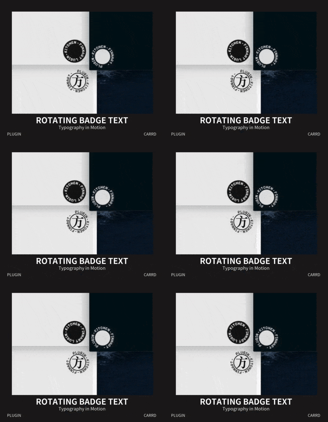
Rotating Badge Text008
Rotating
Badge Text008
Typography in Motion
With this plugin, you can transform the Gallery element into a Rotating Badge Text and customize its style to match your website.

plugin - kitchen - finnart -
Ingredients: CSS, JavaScript
▼ Free - receive TXT files and a PDF guide.
You'll need at least the Carrd Pro Standard Plan (with the embeds feature) to use this plugin.
launched
2025-03-19
Theme Toggle009
Theme Toggle009
Default <-> Custom
Maintain your website’s default style while creating a custom one for switching.
-
Expand the demo below to preview the effect more detail.
Ingredients: CSS, JavaScript
▼ Single License - $30 USD
▼ Unlimited License - $300 USD
You'll need at least the Carrd Pro Standard Plan (with the embeds feature) to use this plugin.
launched
2025-03-24
Divider
Image - applies effect to the border.

Gallery – applies effect to the border and caption.

caption
Timer
Widget – no effect.
Table
| Title | Author | Year |
|---|---|---|
| Neuromancer | William Gibson | 1984 |
| Snow Crash | Neal Stephenson | 1992 |
| Software | Rudy Rucker | 1982 |
| Title | Author | Year |
|---|---|---|
| Neuromancer | William Gibson | 1984 |
| Snow Crash | Neal Stephenson | 1992 |
| Software | Rudy Rucker | 1982 |
Form – no effect on button's background color.
Theme Customization Options
Font Color – Affects the Icon/Button icon color as well.
Border Color – Affects the Icon, Button, Image, Gallery, Form, Table outline-border and the container border.
Divider Color
Background Color – Applies when your website’s default background is set to a color.
Page Color
Page Border Color
Container Color
Badge Font Color – For the 008-Rotating Badge Text.
Badge Background Color – For the 008-Rotating Badge Text.
Gutters/List Bullet – Automatically inverts the color from the default color.
Advanced Settings – For Carrd Pro Plus
Exclude elements from the Theme Toggle.
Invert specific elements.
Overlay Tag010
Overlay Tag010
Buttons & Icons → Tag
This plugin lets you easily add tags to various elements, such as images, galleries, or containers. It’s as simple as it sounds!
Ingredients: CSS, JavaScript
▼ Free - receive TXT files and a PDF guide.
You'll need at least the Carrd Pro Standard Plan (with the embeds feature) to use this plugin.
| Update | Launched |
|---|---|
| ss(2025-08-12)tt(• Supports non–full-size images • Resolves conflicts with Shimmer)ee | 2025-03-26 |
Swipe Scroller011
Flexible Element Count
Convert your container content into a horizontal scroller to showcase services or images. There is no limit on the number of elements.
Ingredients: CSS, JavaScript
▼ Single License - $15 USD
▼ Unlimited License - $150 USD
You'll need at least the Carrd Pro Standard Plan (with the embeds feature) to use this plugin.
launched
2025-04-02
Introduction012
Introduction012
Step by Step
This plugin lets you create step-by-step introductions for your page sections. You can set it to display automatically or trigger it with a button click. The style is customizable.
Ingredients: CSS, JavaScript
▼ Single License - $60 USD
▼ Unlimited License - $600 USD
You'll need at least the Carrd Pro Standard Plan (with the embeds feature) to use this plugin.
launched
2025-04-07
Magnifier013
Hover over the image to see it in action ▼

Gallery

Gallery
This plugin allows you to magnify images—including galleries and slideshows—to size you prefer. It also supports external image URLs as zoom sources.
Magnify. Focus. Discover.
Ingredients: CSS, JavaScript
▼ Single License - $30 USD
▼ Unlimited License - $300 USD
You'll need at least the Carrd Pro Standard Plan (with the embeds feature) to use this plugin.
launched
2025-04-12
Floaty BG014

Hover over to experience it.
Floaty BG014
For the Background Pattern
Add a floating animation effect to your page or container background pattern that responds to user cursor movement.
Ingredients: CSS, JavaScript
▼ Free - receive TXT files and a PDF guide.
You'll need at least the Carrd Pro Standard Plan (with the embeds feature) to use this plugin.
| Update | Update | Launched |
|---|---|---|
| ss(2025-09-17)tt(• Supports page's pattern • Supports non–full-width containers)ee | ss(2025-08-12)tt(• Supports mobile devices)ee | 2025-04-18 |
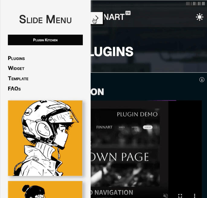
Slide Menu015
Slide Menu015
This plugin transforms your container into a side slide menu, which can be positioned on either the left or right side of the screen.Additionally, you can set the menu to remain fixed on larger screens — the rest of the page content will automatically adjust to fit the remaining space. On smaller screens, the menu will return to its sliding behavior for a more responsive experience.
Ingredients: CSS, JavaScript
▼ Single License - $15 USD
▼ Unlimited License - $150 USD
You'll need at least the Carrd Pro Standard Plan (with the embeds feature) to use this plugin.
launched
2025-07-18
Gallery Content016
Gallery Content016
◀ Click image to see it in action
▲ Click image to see it in action
This plugin enables you to display your content within a gallery lightbox, expanding possibilities for user engagement.
It also supports background color customization and swapping content and image order — perfect for creating more dynamic and interactive presentations.
-
Heads-up: the following are not supported.
1. Iframe-based elements (Audio, Embed Video, Embed Iframe)
2. Video thumbnail image.
Ingredients: CSS, JavaScript
▼ Single License - $30 USD
▼ Unlimited License - $300 USD
You'll need at least the Carrd Pro Standard Plan (with the embeds feature) to use this plugin.
| Update | Launched |
|---|---|
| ss(2025-09-14)tt(• Supports Iframe elements)ee | 2025-07-26 |
Break free from layout limits.
Quisque ligula nullam lectus taciti donec volutpat porttitor cursus ante. Vehicula in vel inceptos quis tristique si dictumst nam adipiscing quam.
Designed for flexibility and control.
| Title | Author |
|---|---|
| Neuromancer | William Gibson |
| Snow Crash | Neal Stephenson |
Go beyond static displays.
Mix content and media effortlessly.
Quisque ligula nullam lectus taciti donec volutpat porttitor cursus ante.
Bring interactivity to your visuals.
Your gallery, your way.
First item
Second item
Third item
Price Switch017
Lite$price• unlimited projects
• email support
• access to all templates
• basic analytics
• cancel anytime
Premium$price• unlimited projects
• priority support
• access to all templates
• advanced analytics
• save 17% compared to lite
▲ Toggle the Switch
This plugin adds a price switch feature to your container columns.
Simply design your column content using Carrd’s native elements — the plugin will handle the logic for the switch functionality automatically.
Ingredients: CSS, JavaScript
▼ Free - receive TXT files and a PDF guide.
You'll need at least the Carrd Pro Standard Plan (with the embeds feature) to use this plugin.
launched
2025-08-02
Carousel ∞018
Carousel ∞018
Infinite Loop
This plugin transforms your content into a seamlessly looping card carousel, automatically connecting the first and last slides to deliver a smooth, continuous browsing experience.
— Perfect for showcasing your services, features in a dynamic and engaging way.
Ingredients: CSS, JavaScript
▼ Single License - $30 USD
▼ Unlimited License - $300 USD
You'll need at least the Carrd Pro Standard Plan (with the embeds feature) to use this plugin.
launched
2025-08-22
Carousel ∞
4
1
2
3
Smoother Scroll020
Interactive Demo ▼
Smoother Scroll020
◀ Interactive Demo
Simply let your site have a smoother animation effect.By refining scroll behavior and easing transitions, Smoother Scroll brings a more polished, fluid feel to your animations — quietly elevating the overall user experience.
Ingredients: GSAP, CSS, JavaScript
▼ Free - receive TXT files and a PDF guide.
You'll need at least the Carrd Pro Standard Plan (with the embeds feature) to use this plugin.
| Launched |
|---|
| 2026-01-31 |
{ FAQs }
You can use in one project for personal or commercial purposes. Resale as a standalone product or within another project is not allowed, and source files cannot be distributed.
You can use in unlimited projects for personal or commercial purposes. Resale "as-is" is not allowed, but you may distribute or sublicense the source files as part of a larger project.
No, the plugins are designed for easy application, and with the included PDF guide, you can set them up easily without coding knowledge.
Seasoning is a tool that extends a plugin’s original functionality. Think of it like LEGO — small add-ons that expand what you can build.When using a plugin, you might want to check back from time to time to see if there’s any new Seasoning released for it.
Payments are securely processed through PayPal. Once the transaction is complete, the plugin files and PDF guide will be sent automatically to the email linked to your PayPal account — there's no need to enter an email manually.Delivery usually happens within a few minutes. Please check your spam or junk folder if you don’t see the email. Need help?
Your email will be used solely to deliver your purchase and will not be used for any other purpose.If you'd like to receive notifications about new plugin releases, feel free to sign up.
You won’t get a discount, but if you ever decide to upgrade or renew your Carrd plan and use me as your referral, I’ll receive a referral credit — only if you’d like to.My referral code: FINNART
{ Contact }
For customer support issues relating to a purchase please fill out the form.
{ Widgets & Tips }
{ WIDGETs }Use the Action Button to preview the widget. Click the Widget Title to see and copy the code snippet.
{ TIPs }The kitchen sink of tips — in the making.
Have a site that presents your style, and show your icons while the page is loading instead of Carrd's default loader. Embed the following code in Head and replace the URL.<style>Try combining this with the Spin-3D widget for a nicer effect.
#loader {
background-image: url(https://your-icon-url-here) !important;
}
</style>
Complex Appearance?Each element comes with many manual settings — especially alignment and spacing.
So is there a rule to follow?Yes. Think of it from top to bottom, from macro to micro:Page → Container → ElementWhen you set the Page-level settings, it establishes the main rule for everything inside it.
If an element’s Contents/Alignment value is set to Auto, it follows the rule of its upper level (Page or Container).You only need to manually set an element’s Contents/Alignment value when you want it to break away from its parent’s rule.The same principle applies to Animation settings.
After setting up the Background and Canvas (Page), all that’s left is adding elements to enrich your site.Among them, there’s one special element — the Container. So when and why should you use it?1. Apply a different style or background
Use a Container when you want a area to have a different color, image, or style from the page/background.2. Better organize elements
Placing elements inside a Container makes it easier to adjust their position and alignment.3. Create columns for layout
The Page behaves like a waterfall — each element takes up a full row by default.
A Container allows you to create columns and give elements their own structured space.
I usually follow this path when starting a new site:1. Decide the background style
Choose the overall background first (solid color, image, slideshow, etc.).
This will appear across the entire screen.2. Set up the Page element
The Page element acts as a canvas. It’s where your site content lives.
But what’s the difference between Default and Box (Wide Box / Tall Box), and which one should you use?• Box
Lets you style the page itself — such as setting a background color, margin, border, etc.
Think of it as creating a card layout.• Default
Focuses more on the content itself. You can’t style the page directly.
It works well when you have rich content that naturally forms the whole layout.Although both can achieve similar results, this is how I usually distinguish between them.
Carrd Standard account users cannot control element visibility on different devices. However, you can use the following code to achieve this.
-
<style>
/* Hide Element on Desktop */
@media screen and (min-width: 736px) {
#gallery01 {
display: none;
}
}/* Hide Element on Mobile */
@media screen and (max-width: 736px) {
#container03, #icons01 {
display: none;
}
}
</style>736px is a common breakpoint between desktop and mobile devices, but you can set it to any value you prefer.
When I first started using Carrd, one thing bothered me: it took a long time to scroll just to find the font or icon I wanted.
Later I realized you can simply type the beginning letter of the font or icon name after the list appears—making the search much faster.
const element = document.querySelector('#text38');1. Here, we use JavaScript select the element with the ID text38 and store it in the variable element.
element.setAttribute('title', 'tooltip content... ...');
2. Then, we set its title attribute to the desired tooltip content using setAttribute.
3. The browser’s built-in behavior automatically displays a default tooltip when the user hovers over the element on a desktop device.
4. If you have a Carrd Pro Plus account, you can add an attribute directly in the element settings (gear icon), for example: title=your tooltip content
#text01 {1. Here, we're selecting the #text1 element as the target.
opacity: 0.8;
padding: 0 0 1rem 1rem;
background-color: #216E5B;
border: 1px solid #FFFFFF;
border-radius: 0 0 16px 16px;
}
2. opacity accepts values from 0 (fully transparent) to 1 (fully opaque).
3. padding uses four values in the order: top, right, bottom, left.
4. Instead of a solid color, you can also use a gradient like: background: linear-gradient(90deg, #color1, #color2);
5. border combines thickness, style (e.g. solid), and color.
6. border-radius with four values sets the corner radius in this order: top-left, top-right, bottom-right, bottom-left.
#container22 > .wrapper > .inner > :nth-child(2) {1. Here, we’re selecting the second column inside #container22.
... ...
}
2. To target a different container or column, simply update the container ID and adjust the :nth-child() selector accordingly.
icon.addEventListener('click', () => {1. Assume you have already selected the icon element and want to add the rotate class when it’s clicked.
icon.classList.add('rotate');
});
2. We use addEventListener to listen for the click event, and classList.add to add the rotate class.
3. You can also add browser:none to the icon in Carrd’s URL column.
const icon = document.getElementById('icons01');1. The code on the right side of the equals sign selects an element by its ID. In this case, icons01 refers to the element's ID, which you can find in the gear icon settings.
2. The selected element is stored in the variable icon, so you can now use icon to reference that element in your code.

Untitled

Set up a gallery with style set to Fixed and 2 columns.
Use a transparent image for one item and turn on Show Captions.
This trick helps you get around Carrd’s column limit for more flexible layouts.
| Tag | Embed Position |
|---|---|
| <style> ... ... </style> | Head |
| <script> ... ... </script> | Body End |
| HTML contents | Inline |
{ Templates }
Choose the one that right for you
| Starter |
|---|
| This template features four well-structured sections, a highlighted menu, and a fixed navbar. Great for fans of a low-key style, or you can change the theme to suit your taste. |
| Sticker |
|---|
| A classic one-page layout with a generous side panel for seamless navigation. Perfect for visual storytelling and presentation. |
| Greed |
|---|
| Grid-based one-page design that gives the entire page stronger visual impact. Ideal for those who want a fast, highly visual presentation. |
| 銀河ステ声が |
|---|
| A fully featured template designed for those ready to build a complete, functional website. It supports news sorting and multiple content categories, making it easy to organize, manage, and present information clearly. |


